I spent a lot of time finally getting to this stage but with various ideas in mind after some sketchbook drawings, I had an idea of what I wanted to achieve. This is my chosen colour; to represent tranquility and happiness. I told my partner and he didn’t get the happiness from this; so to elaborate – Happiness is depicted by this colour through the idea of peacefulness… rhythmic waves, tropical paradises.. It is the clearest of blues when you look out to the ocean as it is the shallower waters near the shoreline.

Chosen colour with shades and tinges, and complimentary colour palette:

Demonstration of learnt skills:


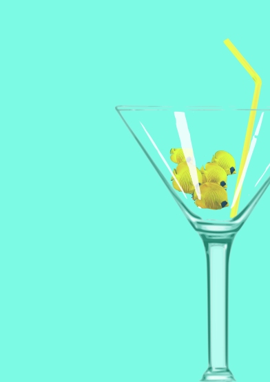 I began by using the magic wand to select the background to make it an object, and also selected certain areas of the glass and duplicated layers to enable me to adjust the transparency for the thinner bits of glass. I altered the hue and brightness of the straw to change it to yellow, and used the magnetic tool around the fish to crop them from the original image; I also reduced the opacity as they needed to look less bright being submersed in the glass. It feels great knowing that I have got to the stage where I can use these tools to create the images I need.

After adding more elements, this was my representation of my chosen colour ^ However I felt it looks rather average and just a ‘collage’ of ideas..

I centred things and re-thought about my compositions… This looked more like a poster to me. I found out how to add text along a specific path and also added the lyrics from before (choosing the more uplifting lyrics to compliment the overall feel). Though, it didn’t feel ‘finished’.
I started to think back to photomontages, and creating images from slicing layers and telling more of a narrative.

Then I thought back to creating more of a contemporary cleaner cut version following the skills we learnt during the Abstract Cities exercise:

I definitely prefer the last 2 designs to the first two as I feel these demonstrate more of my skills as well as having more interesting features through the way things have been layered and composed. I feel that I have adhered to the brief by celebrating this colour, working with a limited palette, and my interpretation of its meaning of tranquility yet happiness, along with a complimentary shade of yellow as this coincides with my ‘tropical’ theme idea, as well as possibly being the most recognised ‘happy’ colour. I have incorporated many images and ideas as well as implementing various tools to alter and manipulate these images to create an overall look.
My chosen final design:
I have chosen this one as I feel it flows with more direction compared to my ‘contemporary’ version. I tried to add white borders to the bikini and rubber ring elements to make it look like a collage, as well as adding a small amount of text to add an interesting aspect and adding ‘background’ elements such as the footsteps, the fish in the top right and the row boats just to lessen the white space and create something more visually appealing to the viewer.
_____________________________________
Once again, I have thoroughly enjoyed Part 3 and building upon skills. I particularly enjoyed looking at ‘Seeing the Light’ and ‘Abstract Cities’ exercise as it made me look at compositions and the visual dynamics when playing around with elements of a design.
I do feel that I struggle finding appropriate images due to copyright laws etc, and so I try to compensate this by edited and manipulating images as much as possible to create my own versions. This is where I need to start using my own images, collecting photographs or making my own art work – something I will look into more for future exercises and assignments.
