Business card 85mm x 55mm
Front:
Back:
Letterhead:
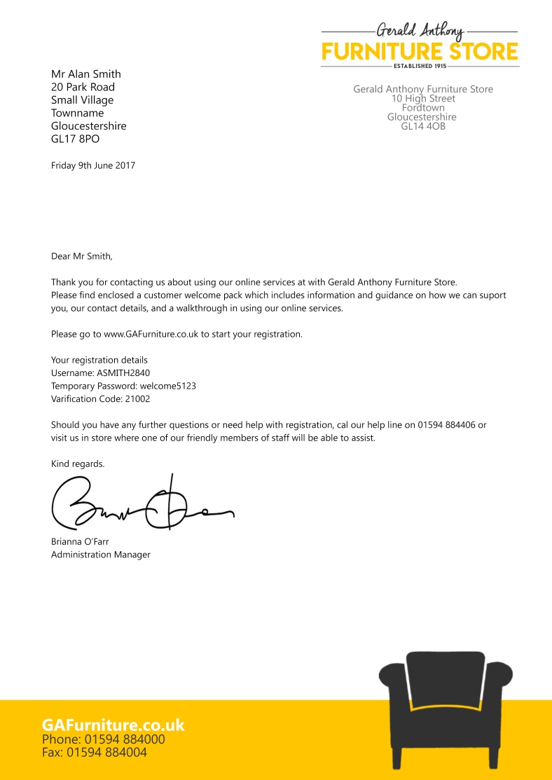
Example with text:
Looking at websites, general layout tends to show logo in the top left, a search bar usually near the middle or towards upper right, and a form of log in system in the right corner. The navigation bar tends to run underneath this, or along the left hand side of the page- based on these generalised findings, I will base my homepage on this layout.


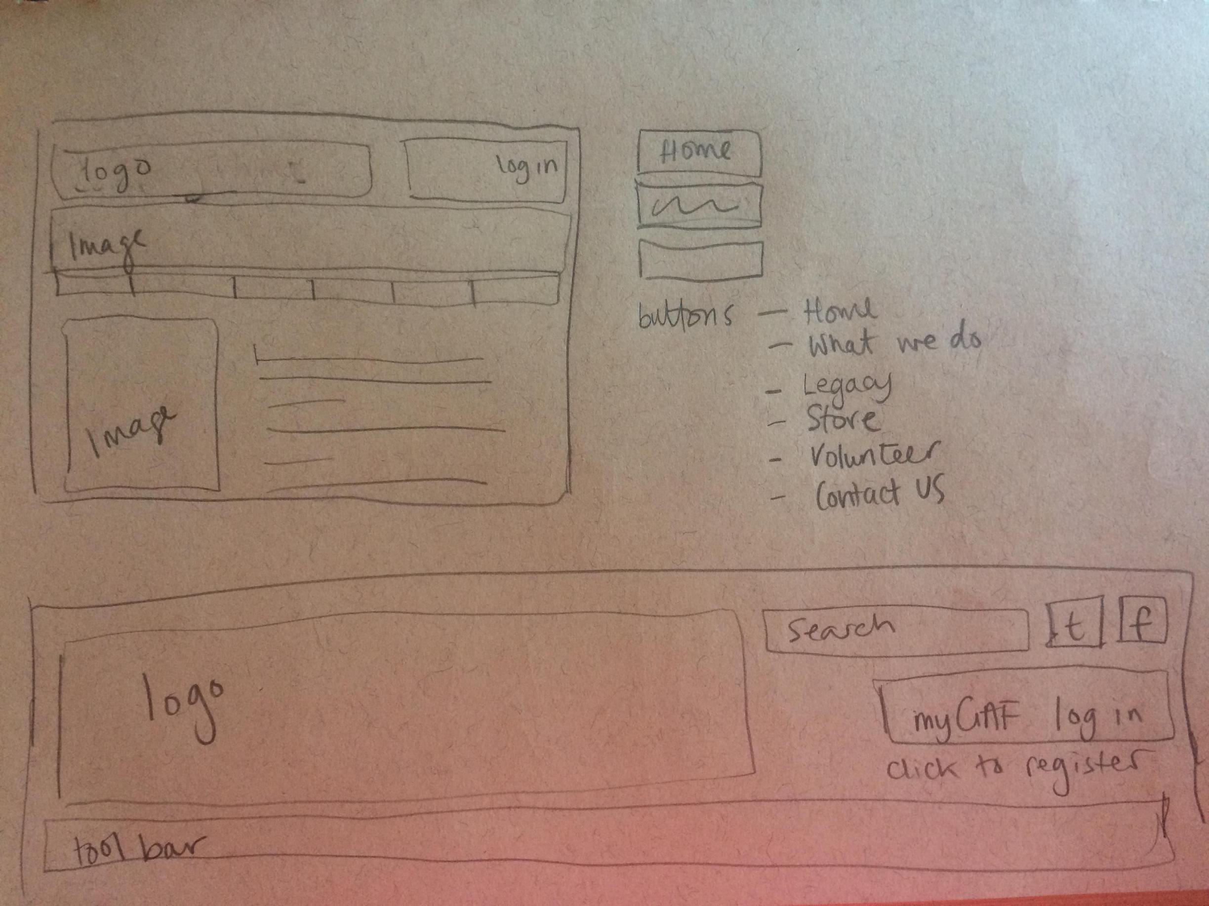

This webpage is based on dimensions of 1366 x 768. Image gained from flickr with no known copyright constraints. I have used my previously chosen colour palette, focusing on a friendly yellow and felt the picture coinsides with the feel I am trying to portray – happy welcoming volunteers – no formality, but a casual and caring service.
Tabs:
Home – general welcome to viewers and brief information on what the charity is about
What we do – more detailed information on the service that can be provided, how it works with funding – data on income, expenditure etc. Also an introduction to key members of staff as well as a thanks to a list of main funders.
History – short history into how the company started and how its developed
Online store – updates on new furniture and how to enquire/apply
Volunteer – a page to advertise recruitment for volunteers
Contact us – Some staff member info and various contact details for each department
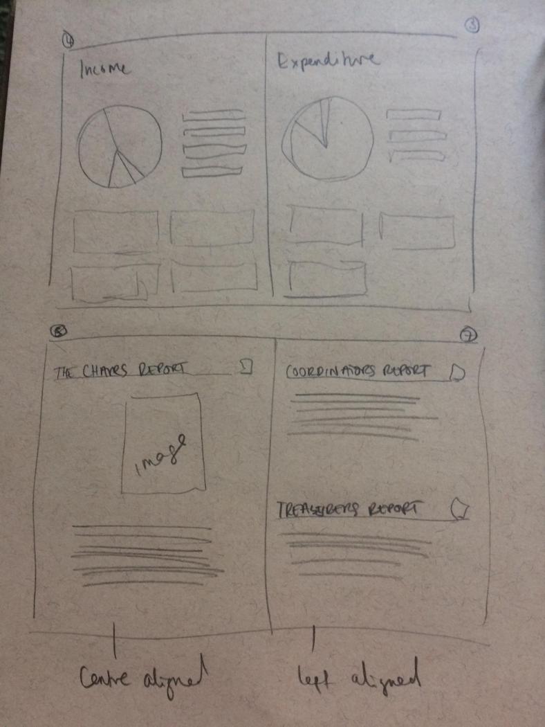
Looking at the 8 page review, I have decided to break the design into the following pages:
Front Cover
2nd page – inside front with blurb on history 90 words
3rd page – names of main grand funders 20 names, and list of comittee and various other members
4th and 5th double page spread – graph/info graphic on income and expenditure
6th page – chairs report
7th page – co-ordinators report and treasurers report
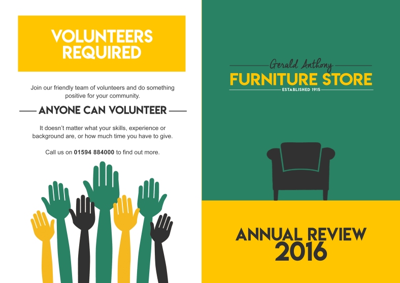
back page – advert to volunteer
I am going to limit images down to the bare minimum. I may use portrait photos on page 3 and a historical photo on page 2 (the picture mentioned earlier), but other than that, just simple chair graphics to keep the formality and stay within the aim of the document – to provide an annual review.
My review will be in A4 format, but I will design the pages as if each individual paper was A3 to staple and fold into an A4 review.

Front & back page:


_________________________________________________
EDIT 30.7.17 following tutor report & suggestions
I need to establish more a link between my chosen imagery and the charitable aspect of this organisation. As I am happy with my imagery and general look, I have thought about replacing the ‘established..’ tag line and using this space as perhaps a motto or catchphrase. Whether this be a pun related to the chairs or just a general tagline… such as…
Let us take the load off/Let us take the weight off
One less worry
Making a house your home
Take a backseat
Chairing for you…
I will test these and use the motto on the businesscard, letterhead and website. (Not annual review as want this to still feel like a professional document)
