Below is a collection of found publications that I felt were easy to read, as well as appealing and eye catching according to typefaces and general type layout:


Examples that I didn’t really like:


I then started looking at clippings and putting them together in my sketchbook in the same manner as above, but to look for specific factors and try and piece together a better understanding as to why I may not like some as much as others:
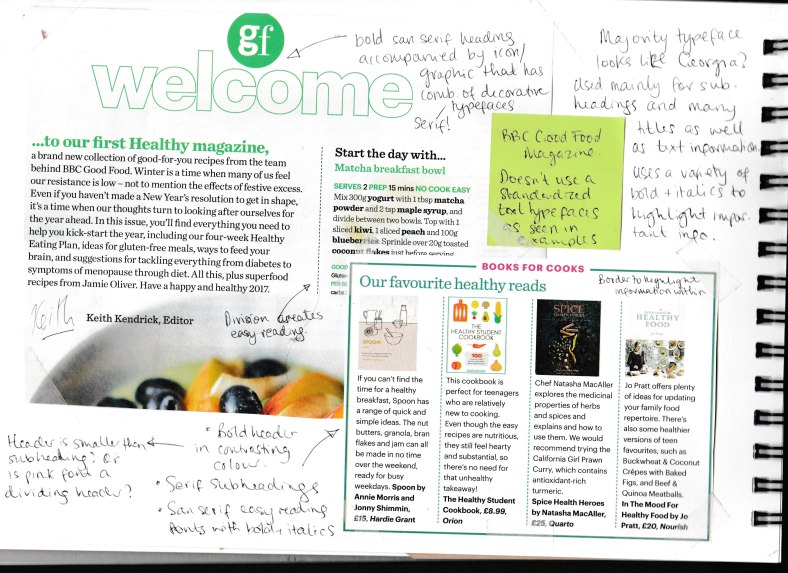
Headings are BIG, BOLD, (and usually) SANS SERIF – however I did notice more serif titles with formal publications.
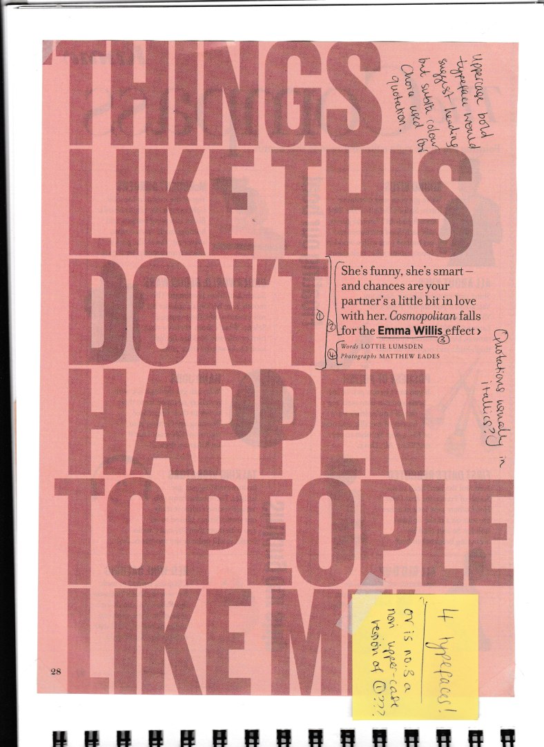
This was an exception where the bold type wasnt a title, but actually a quote; despite quotations usually being in italics.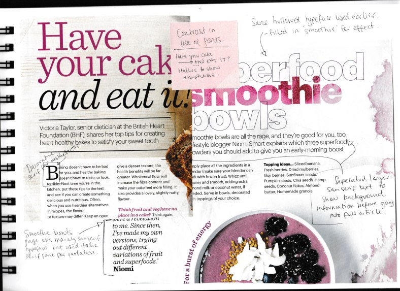
Have your cake… AND EAT IT… the use of italics and a darker, stronger colour to highlight the emphasis behind what the author is getting across.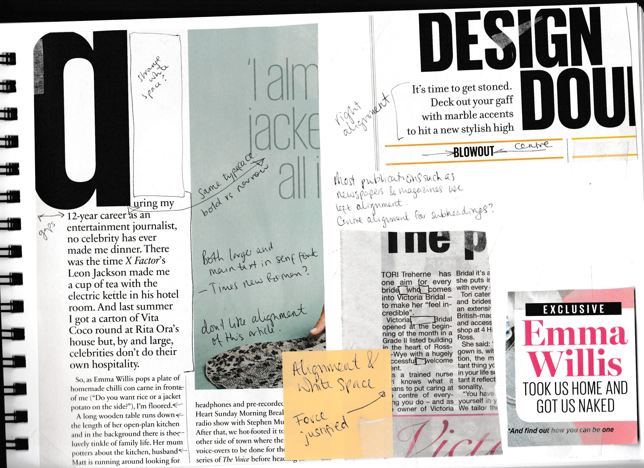
At this point, I started looking at alignment… I wasn’t favouring the article to the left… I felt like it was rather disjointed with its varying white space – it just didn’t flow very well to me. I began noticing how newspapers use force justified a lot to create a more uniform structure within their paragraphs.. This is something I noticed in an earlier exericise when trying to create a magazine article. It looks neater and more pleasing to the eye compared to lots of ‘half lines’ and empty white bits. Most publications seem to use left alignment for their paragraphs, and centre alignment for titles… a mix for subheadings.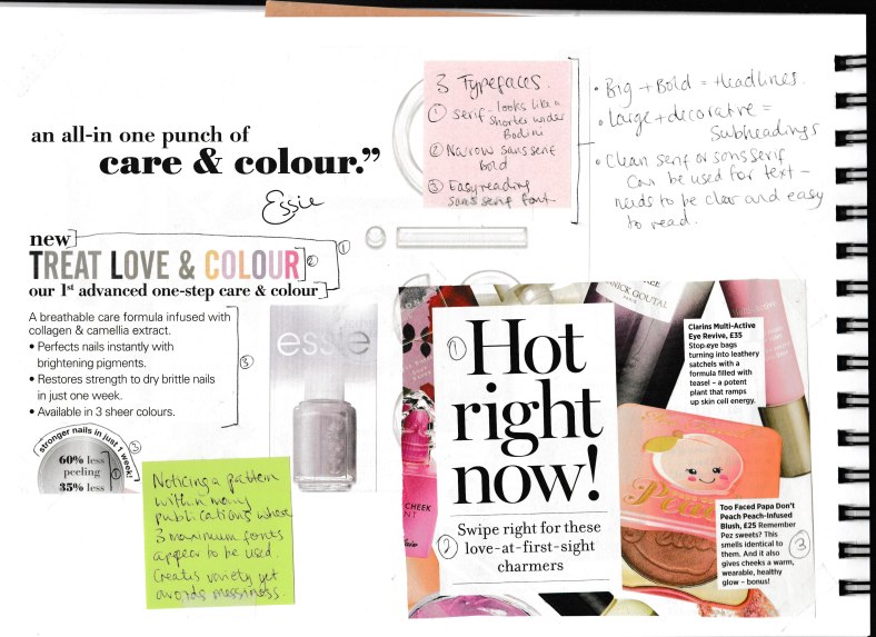
I really didn’t like the Essie advert… The text looks all over the place! I had noted before this that most publications seem to use a maximum of three typefaces; and this article only uses three, but those three typefaces vary in such amounts that it makes the various elements look disjointed. I feel that the TREAT LOVE & COLOUR is the only element that creates this messy feel.. and if it were in the same typeface used for the bulletpoints, this would work better. The used typeface looks out of place and doesn’t compliment the serif and sen-serif font being used for the rest of the print.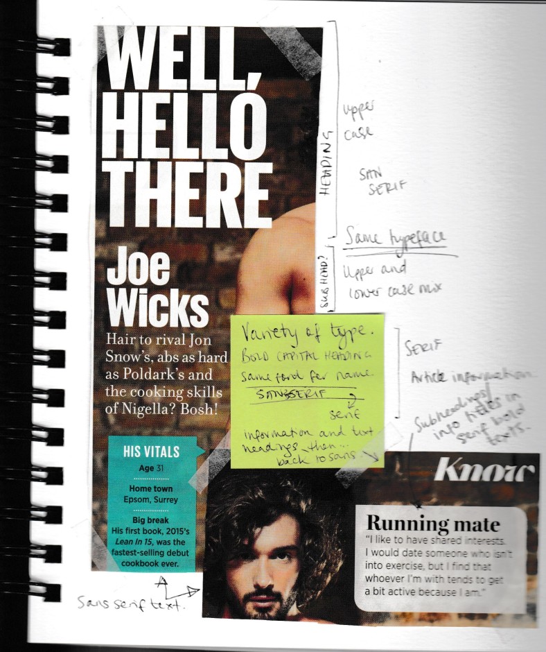
I did like the above article but something niggled me with the bold headline and subheading. I like the contrast between big bold white WELL HELLO THERE compared to the ‘hair to rival…..’ text. But the Joe Wicks looks slightly odd as it is the same font as the headline, but doesn’t use uppercase throughout. I may have used JOE WICKS in capitals just in a smaller size if I were to recreate this. The same contrast between ‘running mate’ serif font and sanserif quotation underneath also looks good.
I found minimal decorative fonts as these publications aim to create easy reading for the viewer; and so I have mainly noted the bold sanserif headings, accompanied by a mixture of serif and sanserif smaller text.
Online examples:

I like the visual layout of this article. The contrasting colours immediately grab the viewers attention but the text compliments each other through the large bold title, accompanied by a smaller introduction in a complimentary colour to the background; and followed by neatly aligned easy-reading text which fits perfectly into sharp squares. The text contrasts against the unruley layout of the illustrative design and general hierarchy works really well.
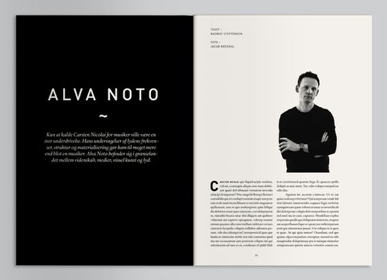
Unlike a previous example where I didn’t really enjoy the messy-looking white space, I feel that the above layout uses white space to an advantage and creates a simplistic but clean finish. Again, the use of a bold sans-serif geometric title is nicely complimented by the italic serif introduction font. The text is a regular serif font but fits nicely in neat and sharp columns. This example is the opposite to the previous in regard to colour and general outlook, however uniform in typeface choice and structure where the introductory text and titles have a strong contrast but informative text is neatly positioned and easy to comprehend by the viewer.
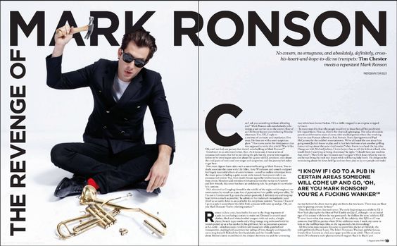
The Mark Ronson article also takes on white space to create a modern and contemporary layout. I particularly like how the title moves around the left hand side of the double spread and is arranged to create the main title ‘mark ronson’ in a large headline-style whilst still being accompanied by an introductory title. Using the big C and R to begin passages of text creates visual interest and compliments the quote; all elements that use the same typeface as the title. The only thing I would critique on this article is that I feel that maybe line length on the text is too long? Maybe there could be more white space surrounding the text borders.
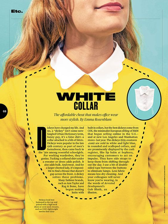
I like the elements used in the above article.. the WHITE COLLAR title has been arranged to appear as though the same typeface has been modified to create a bolder shorter & more dominant WHITE whilst COLLAR looks stretched and more formal and ‘proper’ which sits alongside the connotations of a collar and top button being fastened etc. The text looks very similar to Times New Roman? and also compliments the formal feel of the article as well as being cleverly aligned to fit the pattern of a dickey. (I also really like how they have used the dash line border which corresponds with tailoring and the pattern line of garments.
____________________________________________
SUMMARY POINTS:
- Communication is key to visual publications so readability is top priority through choosing easy-reading typefaces that contrast against the chosen background
- Create interesting contrast using italics and bold versions of a typeface but not when using more than two fonts as this can make the overall feel of the article look messy
- Don’t overcrowd with capital letters as they can make the viewer feel like they are being shouted at!
- Think carefully about layout and the overall feel that I am to achieve… Avoid a mismatch of white space including paragraph alignment and use force justified if necessary (and learn how to do this !? find out whether there is a setting for this to occur naturally or whether this is a manual input)
- Hierarchy is also a big priority as it signifies importance; big bold headlines, complimentary smaller text for introductory information, and small but easy reading text in the form of paragraphs or columns.
- Spacing…I do like the use of force justified but don’t go OTT as irregular word spacing can be distracting. Kerning can play a vital role with headlines and titles.. spaced out letters can signify high importance with bold capitals.
- Think about alignment… Centre alignment doesn’t tend to be prominent for paragraphs but can work well as introduction text, most publications appear to use left alignment as this creates a neat edge and allows for easy reading whilst right alignment can sometimes distort flow with large pieces of text.
- Use a consistent and complimentary font palette as lots of different fonts can create a messy feel. Think about audience when choosing font palette as comic sans wouldn’t work well for a serious publication the same as times new roman may not be suitable for a children’s poster. 2 or 3 fonts tends to be maximum found in the examples i have come across.
- Dont use decorative fonts for body text. However these can work well for subheadings.
- White space can be effective in pointing the viewer to the direction of the main elements of the publication .. not enough white space can create a busy and overpowering feel.
